How to Make a Roblox Thumbnail That Gets Clicks
Updated · By the BloxGFX team
A Roblox thumbnail that gets clicks shows one clear subject with a readable emotion, uses strong contrast so it works at phone size, keeps text to a minimum, and is exported at 1920×1080 (16:9). Then you test several versions and keep whichever earns the most plays. Here's how to do each step.
3 free credits/month · no credit card
Why your Roblox thumbnail matters so much
Players decide whether to open your experience in a second or two, usually on a phone, while scrolling past dozens of other games. Your thumbnail and icon are almost all they see in that moment. A better image doesn't change your game — it changes how many people ever find out how good it is.
Roblox's discovery systems also pay attention to how players respond to your listing and to your game once they join. A thumbnail that earns clicks but misrepresents the game tends to backfire, because those players leave quickly. The goal is an image that's both appealing and honest.
What size should a Roblox thumbnail be?
Make Roblox experience thumbnails at 1920×1080 pixels (16:9) and export as PNG or JPG. Designing at full size keeps the image sharp everywhere it appears, and Roblox scales it down for smaller surfaces. Your game icon is a separate 512×512 square — see Roblox image sizes for every format.
| Asset | Size | Notes |
|---|---|---|
| Experience thumbnail | 1920×1080 px (16:9) | PNG or JPG; you can upload several per experience |
| Game icon | 512×512 px (1:1) | Corners are rounded — keep key art centered |
| Game pass icon | Design at 512×512 | Displays much smaller in the store |
| Badge icon | 512×512 px | Cropped to a circle |
Composition: one subject, one story
The most common thumbnail mistake is trying to show everything. A busy scene with ten characters, five items and a detailed map turns to noise at small sizes. Strong thumbnails pick one focal subject and build the frame around it.
- Make the subject big. Your main character should take up a large share of the frame — often a third or more — not stand small in the middle of a landscape.
- Use the rule of thirds. Place the subject slightly off-center and let the background or the "thing" (a monster, a pet, an explosion) fill the other side.
- Tell a micro-story. A character reacting to something is more compelling than a character standing still. Fear of a monster, awe at a giant egg, triumph at a finish line.
- Use scale. A tiny player next to something enormous is one of the fastest ways to communicate "this game is big".
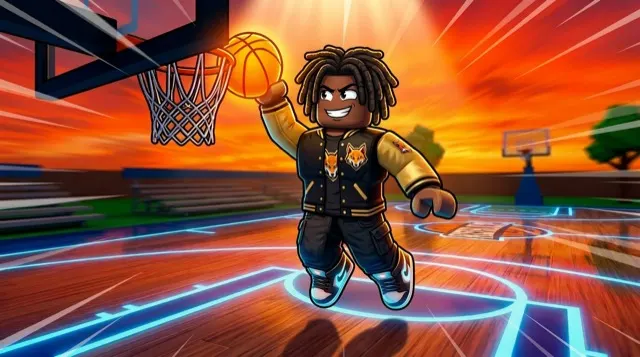
Faces and emotion: why expressions earn clicks
People are drawn to faces, and an exaggerated expression tells a viewer how to feel about your game before they've read a word. Shock, fear, excitement and determination all work — pick the one that matches what your game delivers.
- Match emotion to genre: fear for horror, excitement for simulators, confidence for tycoons, intensity for fighting games.
- Make expressions bigger than feels natural. Subtle expressions vanish at thumbnail size.
- Point the character's gaze or gesture toward the second most important element, so the eye travels across the image.
If you're generating thumbnails with AI, put the emotion in the prompt explicitly — "shocked face", "terrified expression", "laughing with arms raised". Models follow emotional cues well, but only when you ask.
Contrast and color: making it readable at small sizes
Most players see your thumbnail on a phone, often a fraction of its full size. Anything that relies on fine detail disappears. What survives is shape, contrast and color.
- Separate subject from background. A bright character on a darker background (or the reverse) reads instantly. Rim lighting — a bright edge around the character — helps a lot.
- Use complementary colors. Orange against teal, purple against yellow, red against blue. They pop against each other and against the site's interface.
- Limit the palette. Two or three dominant colors look intentional; ten look chaotic.
- Watch dark images. Horror thumbnails should be dark overall, but the focal point still needs to be clearly lit.
The squint test: shrink your thumbnail to about the width of a thumbnail on a phone screen and squint. If you can still tell what's happening and who it's about, it's working.
Should you put text on a Roblox thumbnail?
Keep text minimal — ideally none, at most a few big words. There are three reasons:
- 1It doesn't read at small sizes. A sentence that's legible at 1920 pixels wide becomes a smudge on a phone.
- 2Your game's name is already shown next to the thumbnail in most places, so repeating it wastes space.
- 3Moderation. All uploaded images go through Roblox moderation, and Roblox's rules restrict what text and claims can appear in images — for example, misleading claims or text directing players off Roblox. Less text means less to go wrong. Check Roblox's current Community Standards and Creator documentation for the exact rules.
If you do use text, make it short ("UPDATE", "NEW PETS"), bold, high-contrast, and add it after generating rather than asking the AI to draw letters, which is unreliable. And make sure it's accurate — an "UPDATE" banner that stays up for months stops meaning anything.
Safe zones: keep important things away from the edges
Your thumbnail appears in different places at different sizes, and the surrounding interface can crop or overlap it in ways that vary by device and over time. The safe approach is to keep the subject, faces and any text in the central area of the frame, with a comfortable margin from every edge.
The same principle applies harder to icons: Roblox rounds the corners of game icons and crops badges into a circle, so anything near the corners will be cut. The game icon guide covers the icon safe zone in detail.
Show the real game (honest thumbnails win long-term)
Stylized GFX is normal on Roblox — most top games use polished renders rather than raw screenshots. But the scene should depict things that are actually in your game. If the thumbnail shows a dragon and there's no dragon, players notice and leave, and that hurts more than a slightly less exciting image would.
A good rule: every major element in the thumbnail should be something a new player can see or do within their first sessions.
How to A/B test Roblox thumbnails
You can't know in advance which thumbnail will perform best, so test. Roblox lets you upload multiple thumbnails for an experience, and the Creator Hub provides tools for testing thumbnails and icons and comparing how they perform. Feature names and locations change over time, so check Roblox's Creator documentation for the current workflow.
- 1Change one thing at a time. Test a different expression, a different color scheme or a different focal subject — not all three — so you learn what made the difference.
- 2Give each test enough traffic. Small differences over a few hundred impressions are mostly noise. Let a test run until the result is clear.
- 3Watch what happens after the click. A thumbnail that raises clicks but lowers playtime may be overpromising.
- 4Keep a log. Note what you tested and what won. Patterns emerge quickly — your audience might consistently prefer bright scenes, or close-ups, or a particular character.
This is where AI generation helps most: making three or four genuinely different variants of the same idea takes minutes rather than a day per render. See 30 thumbnail ideas with prompts for starting points.
Common Roblox thumbnail mistakes
- Too much going on. If you can't describe the thumbnail in one sentence, simplify it.
- A raw, unlit screenshot. Default lighting and a UI-cluttered screen rarely compete with polished GFX.
- Tiny characters. The subject is lost in the scene; zoom in.
- Paragraphs of text. Nobody reads them at thumbnail size, and they invite moderation problems.
- Low contrast. Muddy colors blend into the page.
- Wrong size or aspect ratio. Non-16:9 images get cropped or letterboxed; export at 1920×1080.
- Misleading content. Showing features the game doesn't have.
- Never updating. A thumbnail that's been the same for a year is a missed chance to re-test and to signal that the game is alive.
Roblox thumbnail checklist before you upload
- 1Exported at 1920×1080, PNG or JPG.
- 2One clear focal subject, large in the frame.
- 3A readable emotion or action.
- 4Strong contrast between subject and background.
- 5Important elements kept away from the edges.
- 6Little or no text, and nothing that breaks Roblox's rules.
- 7Everything shown actually exists in the game.
- 8Passes the squint test at phone size.
- 9At least one alternative ready to test against it.
To make one quickly, describe it to the Roblox thumbnail maker or follow the step-by-step how to make a Roblox thumbnail guide. Comparing tools first? See the best AI Roblox thumbnail makers.
FAQ
What makes a good Roblox thumbnail?
One large focal subject with a clear emotion, strong contrast so it reads at phone size, minimal text, important elements kept away from the edges, and content that honestly reflects the game. Export it at 1920×1080.
What size is a Roblox thumbnail?
1920×1080 pixels, a 16:9 aspect ratio, saved as PNG or JPG. The game icon is a separate 512×512 square.
Can you A/B test thumbnails on Roblox?
Yes. You can upload multiple thumbnails for an experience, and the Creator Hub offers tools to test thumbnails and icons and compare their performance. Check Roblox's Creator documentation for the current steps.
Should a Roblox thumbnail have text?
Keep it minimal or leave it out. Text is hard to read at small sizes, your game's name is already shown nearby, and all images go through Roblox moderation.
How often should I change my Roblox thumbnail?
Test new versions regularly and swap in update or event thumbnails when you ship something new. Keep the winner of each test, and revert seasonal thumbnails once the event ends.